Hitchology
Start Date: 2011
Role: Product Manager, Product/Brand Designer
The Problem and Opportunity
Hitchology began as a vision to be a one-stop shop for wedding coordinators and morphed into a shared web app for wedding coordinators and couples to plan weddings. I came into this process as the project lead and product/brand designer.
At the time we began this project all major wedding coordination websites were cluttered, poorly designed and subpar in terms of tools. The success of this web application hinged on our ability to translate the couples needs into a simple seamless design. We also had to challenge a bride-focused industry by providing an experience for both the groom and bride. We were reaching out to a new market: the groom.
We wanted to stand out not only visually but also because of the experience we were providing for users to work together.
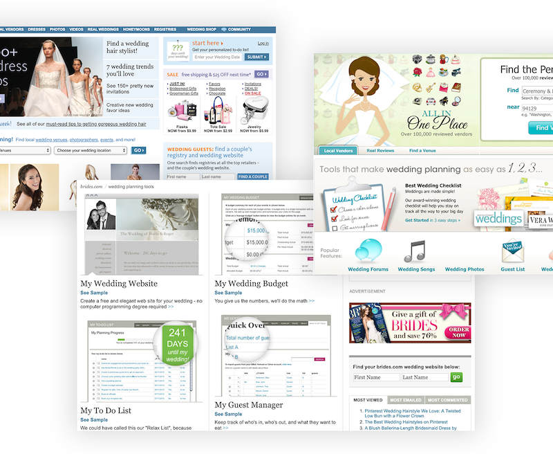
Examples of the main wedding coordination web applications of the time we were up against
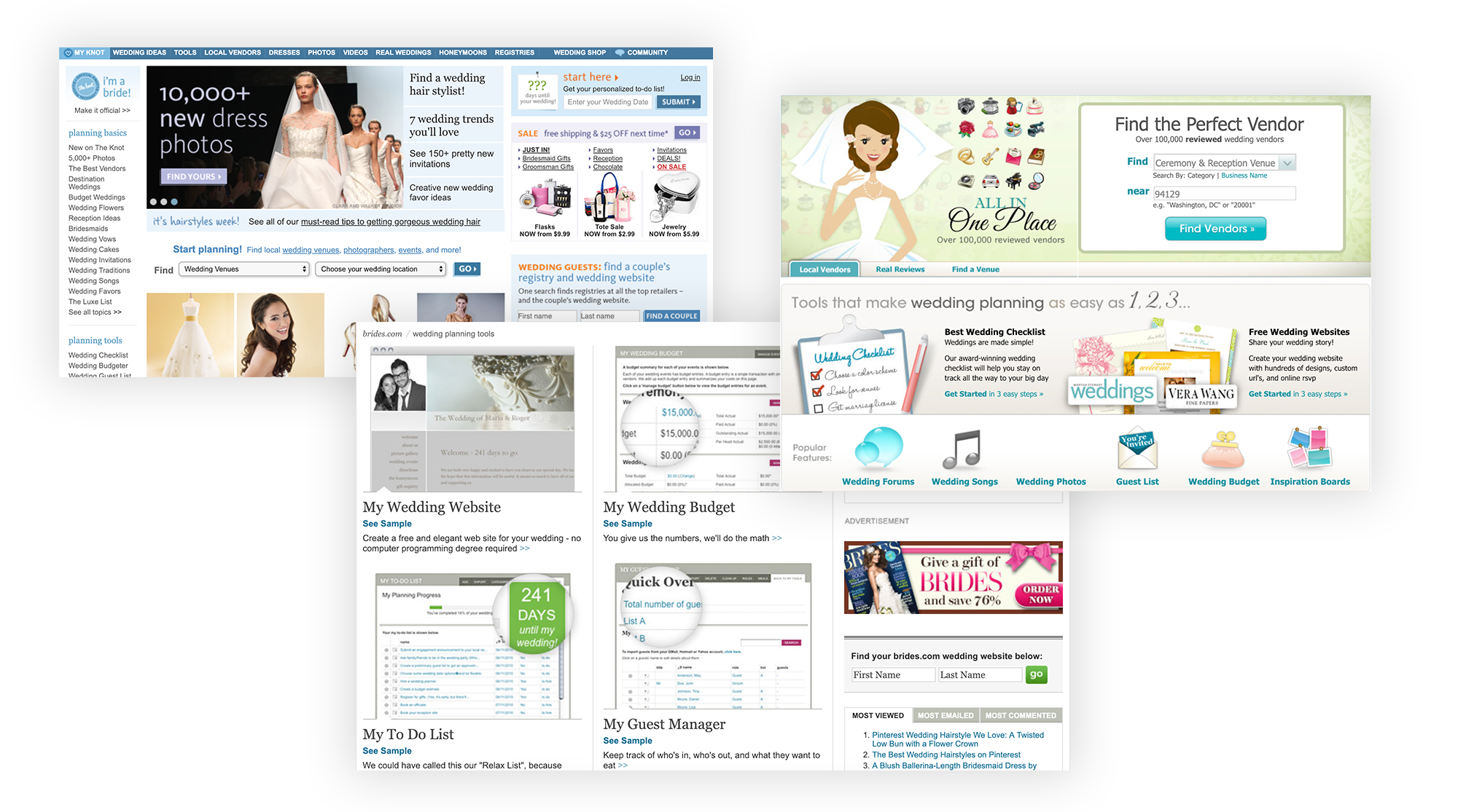
Examples of the main wedding coordination web applications of the time we were up against
The Tasks
- Take the clients vision and translate it into deliverables
- Lead a team to conceptualize, plan and build a solid web application with over a dozen features
- Challenge the standards of the competition and focus on Hitchology’s unique offerings
- Maintain an adaptable approach to business plan changes as while continually updating contract terms
The Process
Step 1: Understand the competition and plan a unique feature set.
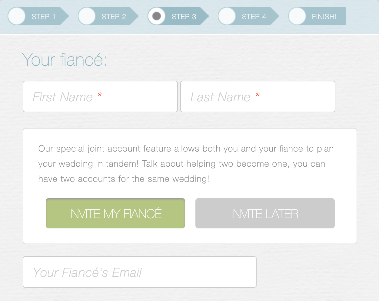
Users can invite their fiancé to jointly edit their wedding details on Hitchology.com
Step 2: Build a solid database to handle the complexity.
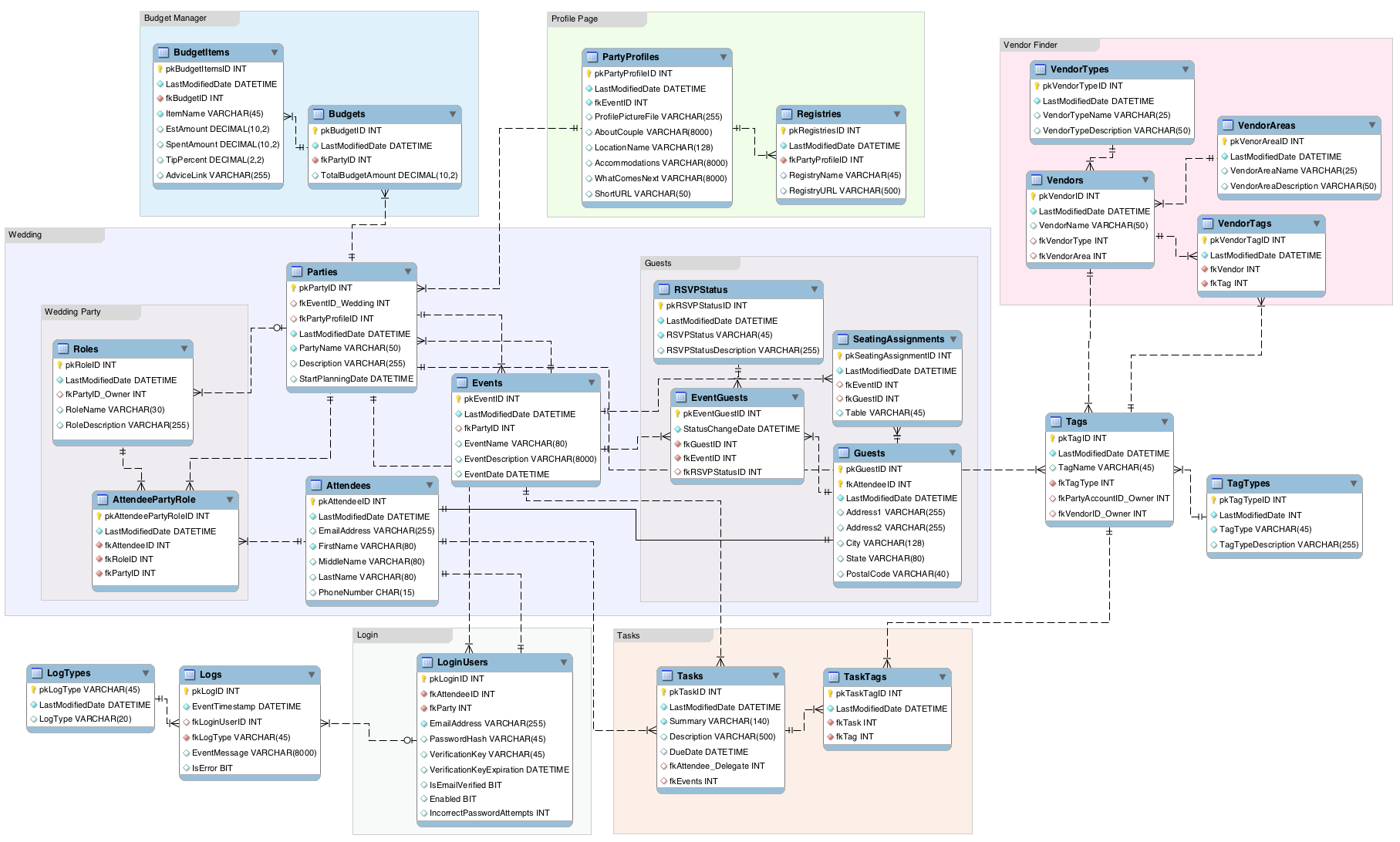
Early screenshot of Hitchology data tables
A lesson I learned during this phase was to have a very clear plan going into database planning meetings. Sometimes we would spend hours talking through one small feature. Even though it was imperative to think through the small details we learned to first work through everything we knew. In those conversations if an item was taking longer than our allotted time I often would cap that conversation for later. Following the meetings we would think through the pros and cons of the different options.
I found that if we let those decisions simmer for a few days a third and better options would often emerge. Giving space to create alternatives apart from the collective group was valuable to our team.
Step 3: Wireframe the UI and begin application development.
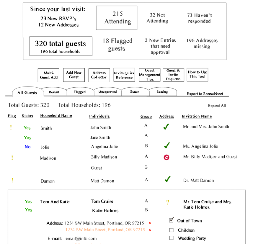
Wireframe of the Guest Book feature
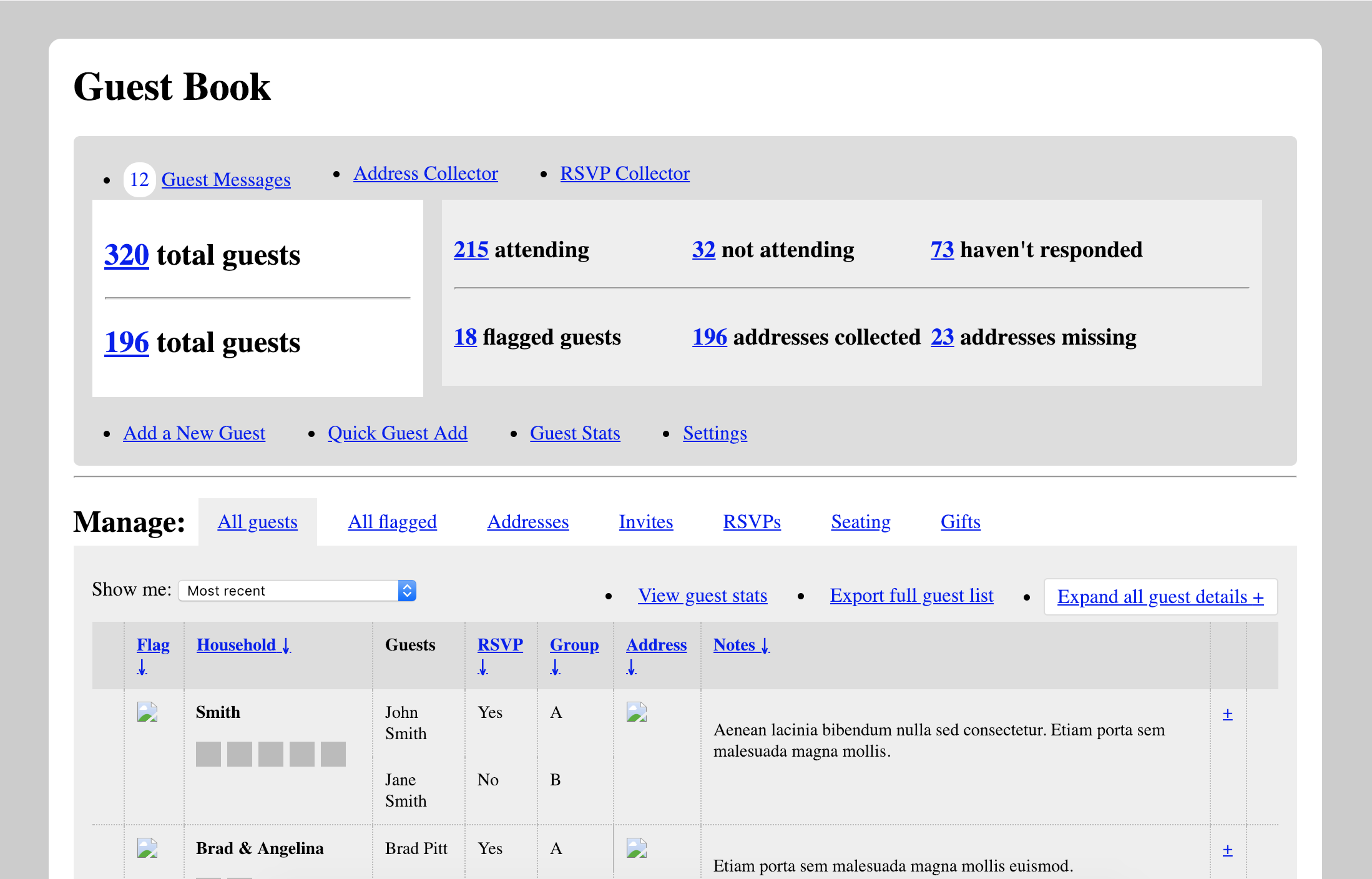
Initial front-end development for Guest Book UI
Step 4: Develop branding and apply design to the UI.
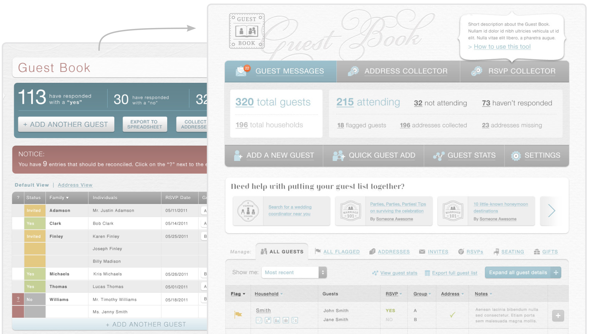
First mockup (left) and final mockup (right) for the Guest Book feature
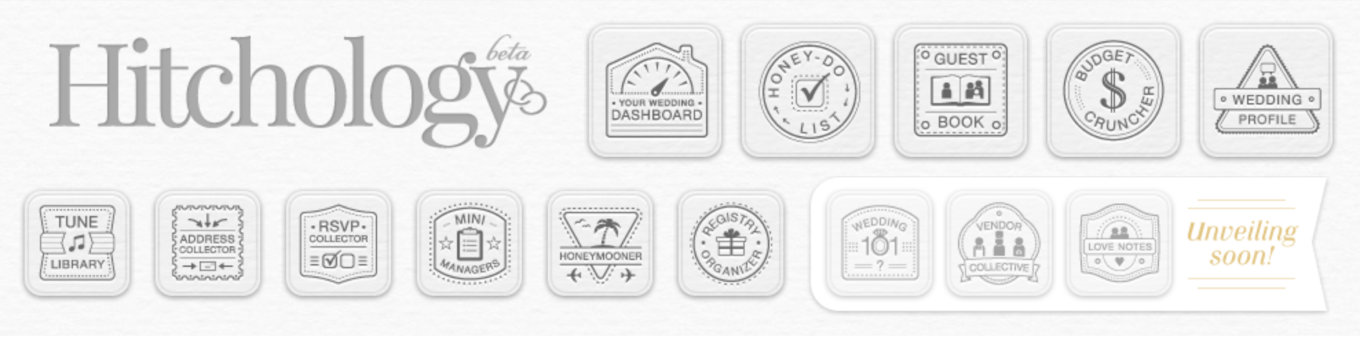
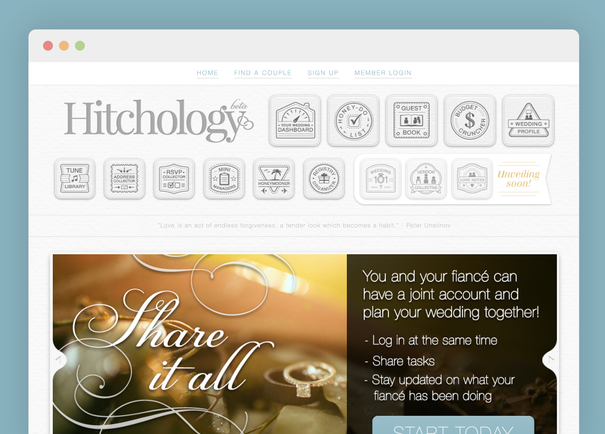
Logo and feature icons are prominent in the UI
Step 5: Test, finalize and launch Hitchology.com.
The process of getting actual user data was helpful in determining what was working and what wasn’t and how we could simplify. In my contract with the owner part we agreed to a phase where we would edit programs, UX, UI based on actual user data.
Most of the programs in Hitchology.com were launched in 2014.
Though the UI design is currently out of date, the UX and database design has stood the test of time and still provides couples with an excellent wedding coordination experience.