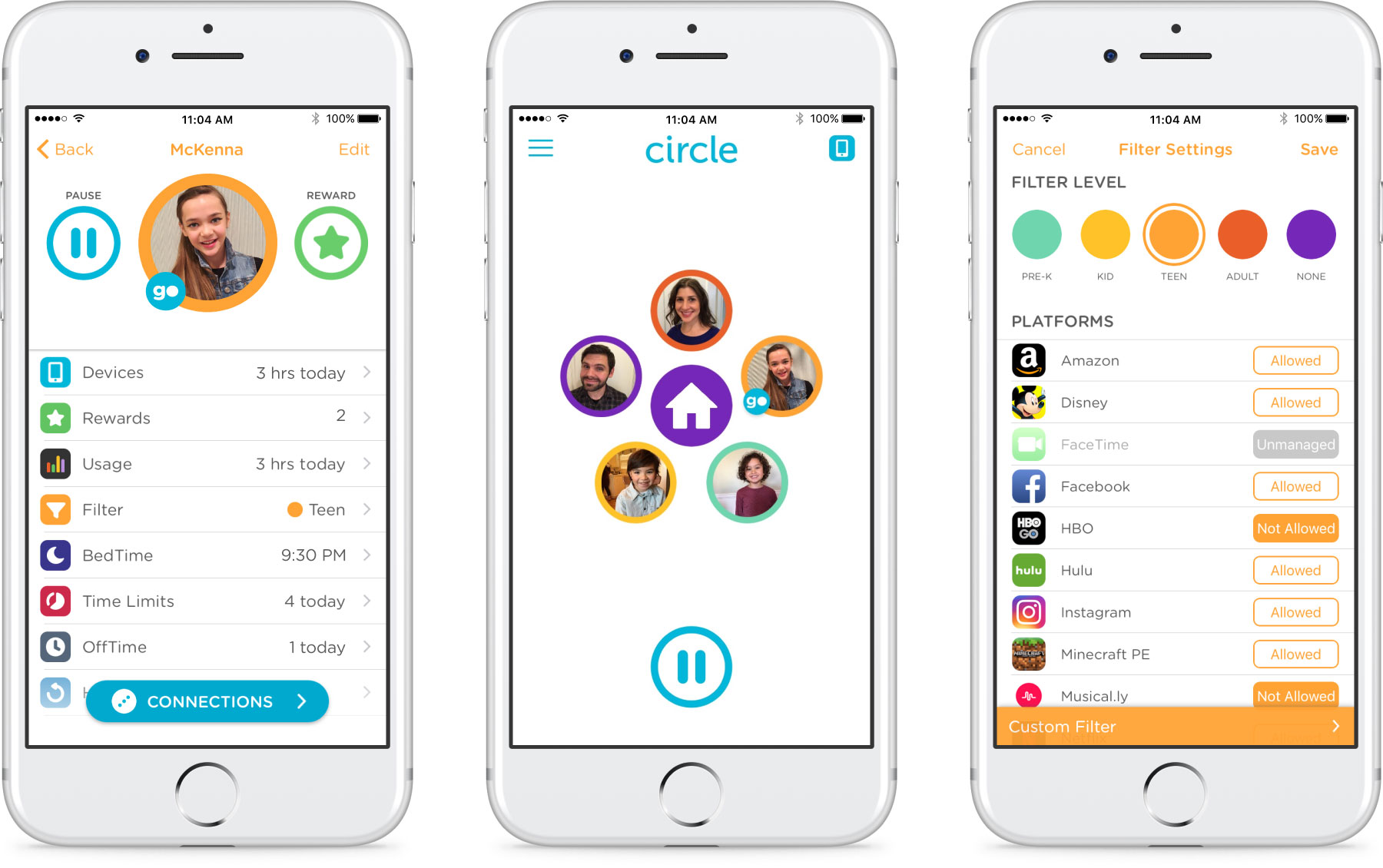
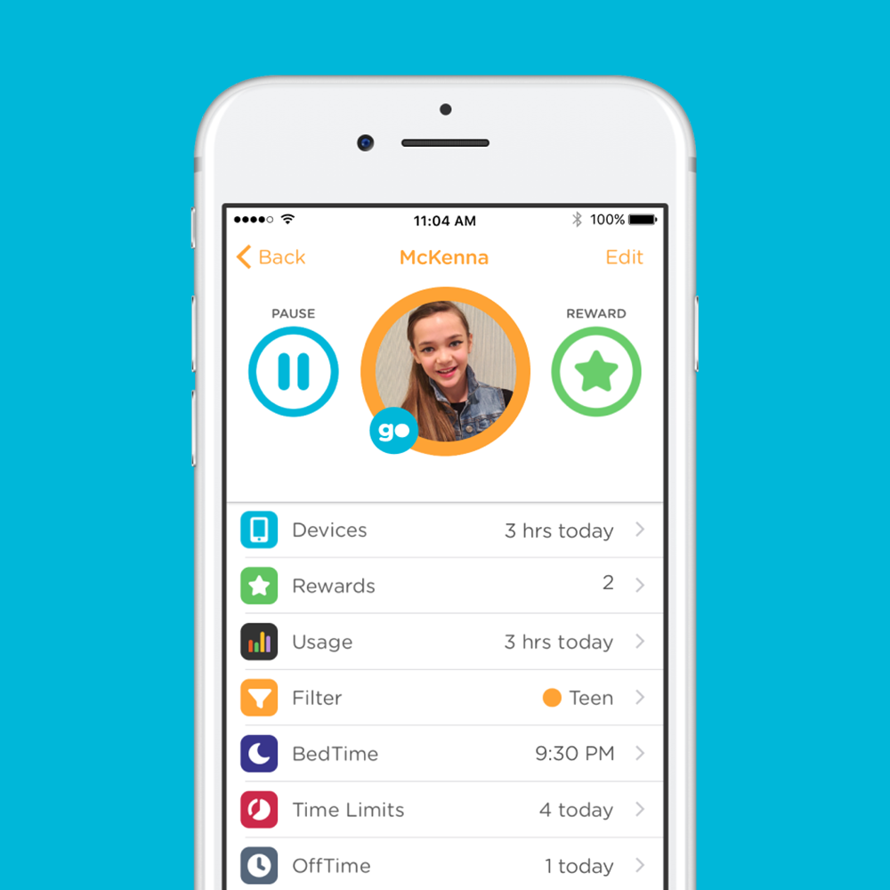
Circle with Disney UI
Start Date: 2016
Role: Lead Product Designer
The Problem and Opportunity
The Circle with Disney product was already making waves in the screen time management marketplace and making a big difference for the families of its users. But the UI was not flexible enough for the Circle team to add the features users were asking for.
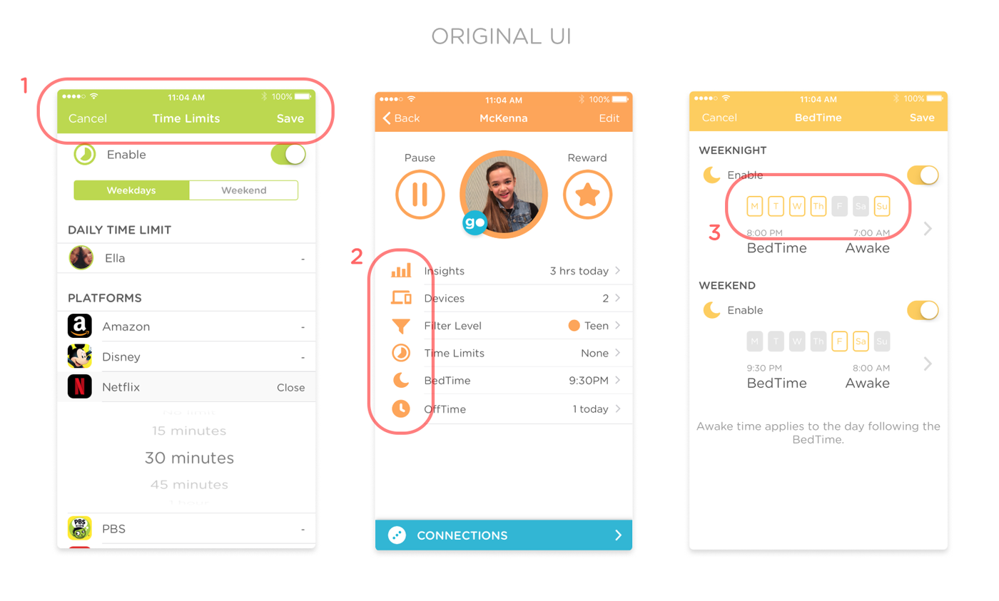
(1) Solid colors in the header created more visual weight in the header and not in the tool itself.
(2) Colors of icons and other UI elements were determined by the “profile’s” filter level, which was confusing as users switched between profiles within their account. This approach to color was also difficult for engineering to develop and upkeep.
(3) Selected states were unclear and inconsistent across the features.
The Tasks
- Update the UI to allow for the addition of features over time
- Make icon set more visually consistent for use in UI and marketing
- Work closely with engineering, product and leadership teams to ensure timeline and development expectations were met
- Account for all screens within the user flow for each feature
The Process
Step 1: Understand the needs. Understand the restrictions.
Designing for growth – I got to be a part of Circle with Disney’s first big app update since the launch. We found that parts of our previous design were limiting our development progress and I was tasked with changing some UI elements. The purpose of these changes was to make the app more scalable for future growth. Changes included:
- decluttering the UI
- creating more visual hierarchy
- bringing consistency to size and spacing
Designing for feeling – UI isn’t only about usability; it’s mostly about feelings. With our first major app update, we wanted users to feel the growth of our brand. My job was to visually create changes that made users feel our brand maturity and build more trust.
Designing against restrictions – This design process was hampered by a short timeline, so work needed to be completed and handed off to development quickly. The short timeline, combined with the method of development for the original UI, created limited opportunities for any significant layout changes.
Step 2: Create user flows.
In order to meet the design needs my team and I created user journey mapping to figure out the different ways users went through our app. This was also to make sure the engineering and developing teams were properly resourced with designs when building out the changes.
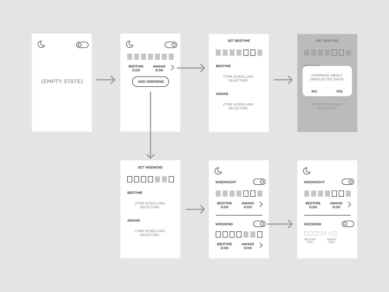
One discovery that came out of this phase was our need for designing the empty states of the app. Up to this point, most empty state screens just included a toggle switch to turn the feature on and off. I was tasked to update the look of those screens to encourage users to interact with the feature.
Step 3: Refocus the icons, color palette and hierarchy.
The original icons were irregular in size, corner rounding and line thickness. The updated icons address these issues.
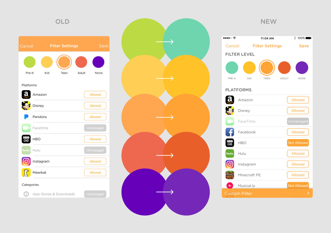
The original color palette had inconsistency in saturation. The updated palette balances the hues. The updated UI focuses blocks of color on action items and important information.
Step 4: Apply the updated look for all the screens.